
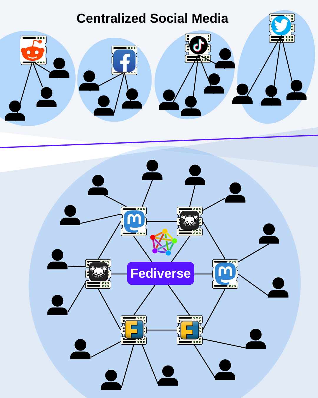
What do you think about this graphic?
It should give an easy overview of the architecture of the Fediverse and what it differentiates from old social media.
What do you think about this graphic?
It should give an easy overview of the architecture of the Fediverse and what it differentiates from old social media.
Interesting. How would you put this into a picture?
My friend (the average social media user) also didn’t seem too interested in it. I can imagine something interesting for the average user in a video but not in an image.
I would add random instance names to the service icons, to show them that the websites are interconnected and not just the services
Largely similar to what you have, but abstracting away the metalware and reframing as human-centric.
If the user is at the center, surrounded by more users, making primary & secondary connections, in an approximate circle shape. You can then show traditional social media owners as wedges of that circle, containing (owning) a fraction of the users & preventing connection to others, vs. Fedi that lets you connect to everyone.