
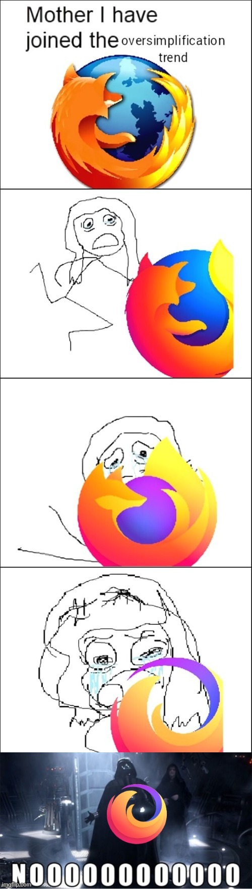
The last one is not the Firefox logo. It’s the logo for the “Firefox Brand” of products (Which includes Firefox, Firefox Monitor, etc.) Firefox the browser uses the second to last logo, and I honestly think it looks pretty good?
Third panel? Yeah, that’s my favorite, too.
I’m raised in a time were foxes had forelimbs but you zoomers don’t seem to know such basic biological facts.
Jokes aside, I prefer the second but it’s obvious just my personal tast.
I still think the classic looks better, but 3 is def second best
It looks like the Edge icon 😂
Firefox has been using this logo design before the new Microsoft Edge logo was used
The last one is not the Firefox logo, but the general Mozilla Foundation logo.
Source: literally just looking at the icon on your desktop.
I know I shouldn’t be the one to nitpick because I posted a similar “design simplification bad” meme myself just yesterday, but still… :D
Are you dumping your “Firefox Memes” folder or something?
Oh are all these posts flooding my Kbin feed one dude?
I’ve seen a lot of Mozilla/Firefox hate the last week or two, which is very surprising to me. What is going on?
Not me… Firefox is destroying itself.
That doesn’t really tell me anything lol
I prefer this icon https://www.deviantart.com/sharif9991/art/Firefox-Anime-Icon-408401407
The 2009 logo was the best
I use sweet candy icon pack so everything is oversimplified lol.
Same icon pack here!


