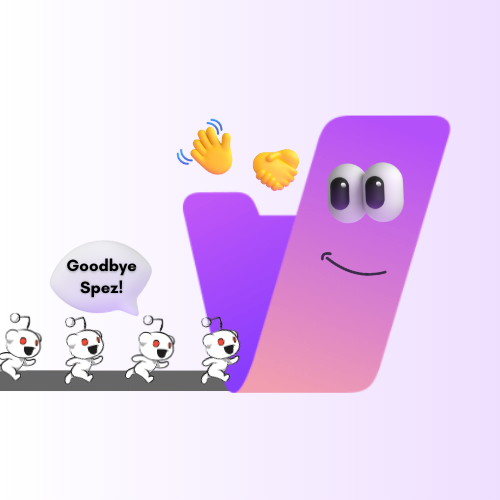
For a long while, platforms have been making tons of usually pointless, often harmful changes to their UI. Reddit & Discord provide tons of examples.
- Reddit’s video player changes have been an issue for as old as time.
- Discord has forced their new mobile UI, which I absolutely despise.
- Reddit’s new logo looks uncanny. (I wouldn’t say the 3D character in general looks awful, and a couple of the expressions are honestly quite cute, but what they went with just doesn’t look good).
- A while back, Discord made messages with multiple images display them in this stupid grid layout that resizes & crops them to death.
And that’s not mentioning all of the other changes that don’t seem to actually accomplish any purpose.
So, why do you think they do this? Is there some good reason to it that I’m missing? Is it strategic business stuff? My personal theory is that they need to have the UI designers doing something and so roll out pointless changes to justify paying them.


I think if most people genuinely liked these features, you’d see people say that more when they’re being discussed. What’s more likely (and what I see way more often) is the second thing you mentioned: that most people don’t really care and just go on with life. But if most users don’t care, it again begs the question of why waste time making these changes at all. It seems like it’s just to keep the UI design team busy more than anything.