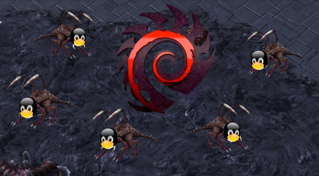
If there was a tier list of Linux Distro logos based purely on logo design quality, Debian would be on bottom tier. It is just an ugly logo. The top would probably be OpenSUSE.
Edit: Suck it, fragile fanboys. The logo IS ugly. The fact that we can’t even point it out without having the downvotes piling on is the reason why Debian still has that eyesore for a logo.
You’re ignoring the rest of the logo that puts it all together. Ultimately I think what makes the Debian logo particularly ugly is the “painted with a scraggly brush” effect.
Since you haven’t given me a point to counter, there ain’t much else to do. I’ll try another approach.
Let’s see your original point, if you can call it:
“…strong wrong opinions…”
So you appear to say that I’m wrong to say that the Debian logo is ugly. From that we can conclude that you find it pretty. I mean, it’s fine. You could have simply argued that beauty lies in the eye of the beholder and that it looks good to you. I would have respected that. Here, I’ve created an adequate retort for you. You’re welcome.
And since neither of us will ever be bothered to do an unbiased street survey on the beauty of a curled twig we will have to leave it at that.
They did argue that beauty lies in the eye of the beholder - so successfully, that you wrote paragraphs to attempt to fight their causal words, and ended up bringing that statement up yourself.
That point was never made I had to make it myself to conclude this stupid disagreement with something that made sense. Even after I did so, essentially agreeing to disagree he kept going, making it obvious he wasn’t even taking this seriously. The guy was just out trolling while accusing me of not wanting to have a “discourse”.
Seriously, you post one opinion that isn’t necessarily popular but that you believe in, someone hijacks it with an immediate downvote and some comment to twist it around to make you the “bad guy” and people just pile on the bandwagon because snarkiness seems to beat arguments in places like that. People can’t be bothered to read more than 2 lines. I thought that shit only happened on Reddit.
I’ve had aliens visit me to tell me they’ve used their unfathomably advanced technology to prove beyond any doubt that I was right and that your sources were wrong. But you’ll also have to trust me on this. Quid pro quo.
Either that or I just find that logo ugly. Pick whichever.
Well, do you know any Linux distro with a not super ugly logo? I have no idea, perhaps Red Hat is quite cool, the rest being a competition of ugliness with no sense. Arch has some sense, and is not that ugly, but it’s not something aesthetic. I think Ubuntu’s logo is quite cool, it even has some sense, but that’s the only good thing I can say about Ubuntu.
We agree, it is ugly. Most Linux logos are made by programmers, not graphic designers and it shows. My point still stands that Debian’s logo stands out as being particularly ugly. I don’t care about the tribal fanboys who predictably took it as a personal attack and piled on the downvotes. Every time I used Debian the first thing I did is get rid of that eyesore everywhere I could.
Also while we’re on the subject can we talk about the K shaped antlers on the KDE mascots? They just never looked like they belong there.
For me Debian is the worst distribution I ever used, excluding Ubuntu (that’s the primer of trash distro). I mean, it must be good for many people, but I just cannot stand it, it’s always obsolete and always breaks on me. I tried to love it for like ten or more years, no luck so far. So its logo is the least annoying thing to me. Their website shows too. Like a competition of ‘we’re a huge community, look, nobody can make a website here!’
Love Debian as server. It’s decent on desktop, but its documentation isn’t exactly geared towards that, and aside from that, I wouldn’t recommend it to a newbie.
but there are a lot of good Debian based distros out there, for desktop and other - and for good reason.
Love Debian as server. It’s decent on desktop, but its documentation isn’t exactly geared towards that, and aside from that, I wouldn’t recommend it to a newbie.
but there are a lot of good Debian based distros out there, for desktop and other - and for good reason.


If there was a tier list of Linux Distro logos based purely on logo design quality, Debian would be on bottom tier. It is just an ugly logo. The top would probably be OpenSUSE.
Edit: Suck it, fragile fanboys. The logo IS ugly. The fact that we can’t even point it out without having the downvotes piling on is the reason why Debian still has that eyesore for a logo.
It’s the magic smoke that makes your computer work.
The original full logo has a lamp that the smoke is coming out of, like a genie.
Spiral : 😡
Spiral on the tail of a chameleon : 😊
You’re ignoring the rest of the logo that puts it all together. Ultimately I think what makes the Debian logo particularly ugly is the “painted with a scraggly brush” effect.
take it easy pal
We need good strong wrong opinions like these to keep discourse healthy
Downvotes. Calls the opinion wrong. Refuses to elaborate. Ignores the discourse going on. Complains of lack of discourse.
Complain? My good sir or madam you and the weighty wrongness of the opinion are the source of such discourse and I do enjoy it so
Please continue
Comes back with the same assertion as before except with added verbal frills, thinking it could pass as substance.
Thank you for being wrong. At least one other has thanked you, but this has improved my experience on lemmy
Narrates other persons actions through projection and snark
Since you haven’t given me a point to counter, there ain’t much else to do. I’ll try another approach.
Let’s see your original point, if you can call it: “…strong wrong opinions…”
So you appear to say that I’m wrong to say that the Debian logo is ugly. From that we can conclude that you find it pretty. I mean, it’s fine. You could have simply argued that beauty lies in the eye of the beholder and that it looks good to you. I would have respected that. Here, I’ve created an adequate retort for you. You’re welcome.
And since neither of us will ever be bothered to do an unbiased street survey on the beauty of a curled twig we will have to leave it at that.
They did argue that beauty lies in the eye of the beholder - so successfully, that you wrote paragraphs to attempt to fight their causal words, and ended up bringing that statement up yourself.
That point was never made I had to make it myself to conclude this stupid disagreement with something that made sense. Even after I did so, essentially agreeing to disagree he kept going, making it obvious he wasn’t even taking this seriously. The guy was just out trolling while accusing me of not wanting to have a “discourse”.
Seriously, you post one opinion that isn’t necessarily popular but that you believe in, someone hijacks it with an immediate downvote and some comment to twist it around to make you the “bad guy” and people just pile on the bandwagon because snarkiness seems to beat arguments in places like that. People can’t be bothered to read more than 2 lines. I thought that shit only happened on Reddit.
Quid pro quo, Brutus, quid. pro. quo. But I have sources, unbiased street surveys but they are paywalled you will have to trust me
What sources do you have?
I’ve had aliens visit me to tell me they’ve used their unfathomably advanced technology to prove beyond any doubt that I was right and that your sources were wrong. But you’ll also have to trust me on this. Quid pro quo.
Either that or I just find that logo ugly. Pick whichever.
It is, most are unfortunately. Linux people don’t care about design. Until now I think, things are getting better.
Well, do you know any Linux distro with a not super ugly logo? I have no idea, perhaps Red Hat is quite cool, the rest being a competition of ugliness with no sense. Arch has some sense, and is not that ugly, but it’s not something aesthetic. I think Ubuntu’s logo is quite cool, it even has some sense, but that’s the only good thing I can say about Ubuntu.
PikaOS!
Guix has a cool logo IMO.
We agree, it is ugly. Most Linux logos are made by programmers, not graphic designers and it shows. My point still stands that Debian’s logo stands out as being particularly ugly. I don’t care about the tribal fanboys who predictably took it as a personal attack and piled on the downvotes. Every time I used Debian the first thing I did is get rid of that eyesore everywhere I could.
Also while we’re on the subject can we talk about the K shaped antlers on the KDE mascots? They just never looked like they belong there.
For me Debian is the worst distribution I ever used, excluding Ubuntu (that’s the primer of trash distro). I mean, it must be good for many people, but I just cannot stand it, it’s always obsolete and always breaks on me. I tried to love it for like ten or more years, no luck so far. So its logo is the least annoying thing to me. Their website shows too. Like a competition of ‘we’re a huge community, look, nobody can make a website here!’
To be fair to Debian though I don’t think it ever was intended for being used as a desktop daily driver.
True. Yet, I hate it as a server too. I use it only on SBCs, but not pure Debian, but Armbian. Otherwise, on an X64 machine, I’d go with Arch.
Love Debian as server. It’s decent on desktop, but its documentation isn’t exactly geared towards that, and aside from that, I wouldn’t recommend it to a newbie.
but there are a lot of good Debian based distros out there, for desktop and other - and for good reason.
Love Debian as server. It’s decent on desktop, but its documentation isn’t exactly geared towards that, and aside from that, I wouldn’t recommend it to a newbie.
but there are a lot of good Debian based distros out there, for desktop and other - and for good reason.