

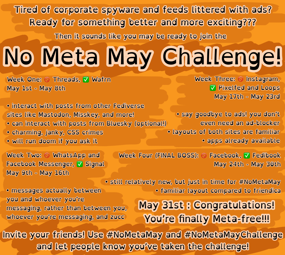
i came up with the idea of a no meta may challenge super last minute and i’ve been enjoying a migraine all day, so i’m taking a break. not a great time for a break when the first day of the challenge ends today but it’s probably fine
i know it’s not great and not everyone will agree with my choices; at the end of the day i think we can all at least agree that the alternatives are still an improvement over staying with meta
thinking i might want to increase the font size on the challenges
if you think it’s a good idea, feel free to edit, share, make your own, idc, fucc the zucc
I apologize if my comment came across as overly critical or unhelpful. All I meant by it is that to my eyes, the brightness of the orange with the white border around the text is a harsh combo. It would be more comfortable with a darker background that contasts more with the white.
See, you did more research than me, so maybe I’m totally wrong.
It’s a good job, I 100% support the graphic and idea behind it and I learned about a couple new services too. Don’t let any of us get you down. You’re DOING something and you should feel good about that.