
Well not really true size but closer.
All projections have distortion since you are placing a 3-D sphere (not even a true sphere) onto a flat surface.
Mercator is a garbage projection though
Mercator is not garbage, it just has a specific use: straight lines on the map correspond to the direction you travel if you maintain a constant bearing. Its still used for naval and avation charts for that exact reason, but it not a good general purpose map.
This is why i like robinson projection, same thing as mercator except squished by the cosine of latitude to account for area distortion

Looks better but is basically unusable for navigation in any sense. Mercator at least preserves direction but not size. Robinson preserves nothing. It combines all the drawbacks without adding any advantages except “looks nice”. Which is actually the philosophy of the projection:
I visualized the best-looking shapes and sizes. I worked with the variables until it got to the point where, if I changed one of them, it didn’t get any better. Then I figured out the mathematical formula to produce that effect.
I can respect that. 10/10 no notes.
I’ll have to avoid that map the next time I’m sailing across the Pacific, then.
deleted by creator
Who uses a full sized world map for navigation? This isn’t the Golden Age of Piracy. You’d have local maps that don’t have any distortion since they’re at a much narrower field of view.
Something like we used in the army like this:
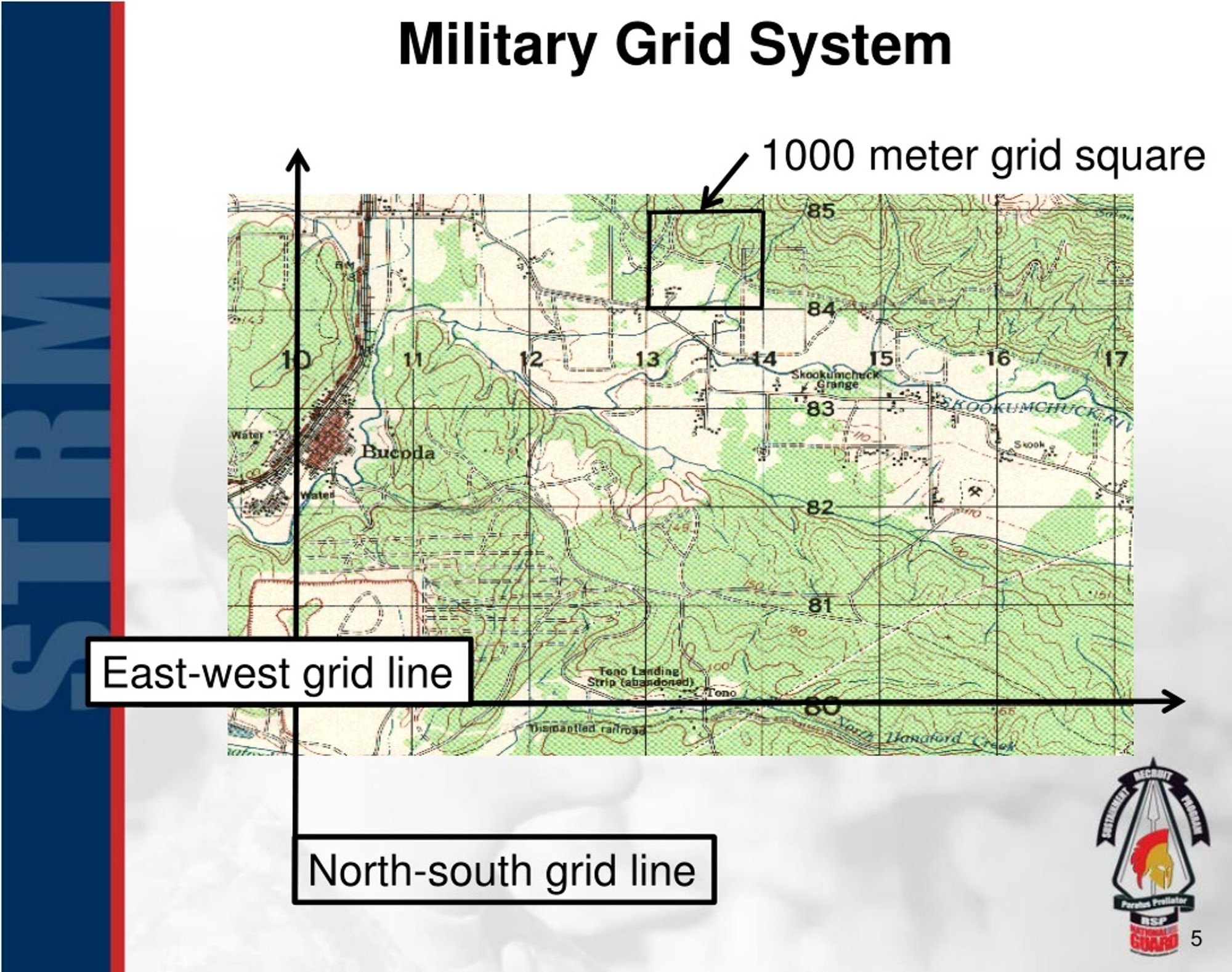
Every day? But not at the scale where I need to view the whole globe
So what’s your favourite Beatles song then?
I don’t pay much attention to xkcd, yet it seems like I’ve seen every xkcd(?)
I’d say this is one of my favorites, and that would be correct, but that’s like saying sweet potato pie is my favorite pie.
I don’t like how those are all equator based. Why doesn’t anyone center the map on Antarctica? 😭

Penguin bot account verified.
Now that’s a useful map!
Why does this view trigger my fear of heights?
I’d not heard of that one, thats super cool!
Small if true
America:

Greenland would like a word.
Also Russia.
How do people drive across the gaps though.
I had a buddy who thought borders were moats between countries, since the borders were coloured blue on our class map. Good ol’ education system winning again.
Imagine my disappointment flying over Kansas and finding out it’s not really pink.
Greenland and the islands above Canada are so stupidly out of porpotion.
Those islands aren’t above Canada, they are part of Canada. (Sorry for being nitpicky, but it can be a politically sensitive topic.)
Is this a penis size chart?
BBC wins again.
I never even saw the Mercator projection before coming into contact with the anglosphere internet. I don’t know why anyone is still using it.
It’s good for sailing
or pointing antennas.Edit: Wait no, you need an actual geodesic for antennas over long distances. If you’re traveling, though, a constant compass heading is indispensable.
Which protection did you grow up with?

probably this one
While maybe not exactly a Mercator projection, it has the same issue of northern countries’ geography being enlarged compared to countries closer to the equator. For example, Russia still looks way to big in this projection too
Haha, Russia 🤏
I think this is my favorite visualization of the size distortion that I’ve seen!
Who the hell was the Mur-Cattor fella and why should we care?
It’s a really good map for navigating at sea. The compass directions are always going to be accurate vs. something like the Robinson projection with accurate size but distorted shape.
Every projection is a compromise and a distortion. Globe is best :)
More to your point, is is probably the most popular projection – even online maps like Google use a version of it – so it is worth being able to recognize it and understand its strengths and weaknesses.
“…a Flemish geographer, cosmographer and cartographer. He is most renowned for creating the 1569 world map based on a new projection which represented sailing courses of constant bearing (rhumb lines) as straight lines—an innovation that is still employed in nautical charts.” - Wikipedia
Basically it was really cool and advanced geometry in the 1500s. Other fun inventions of the time included bongs, rifles, and knitting machines.
US looks bigger than Canada in this map. It isn’t.
What’s the dark blue vs light blue?
Russ is a really cool map. I love maps that show the actual size comparison.
Dark represents the actual sizes in relation to each other. Light blue is the mercator projection, inflating our ego in the northern hemisphere.
Yikes.
No Antarctica?
It’s there. It’s the tiniest dot there at the bottom.
I don’t believe you.
This should be the standard.


