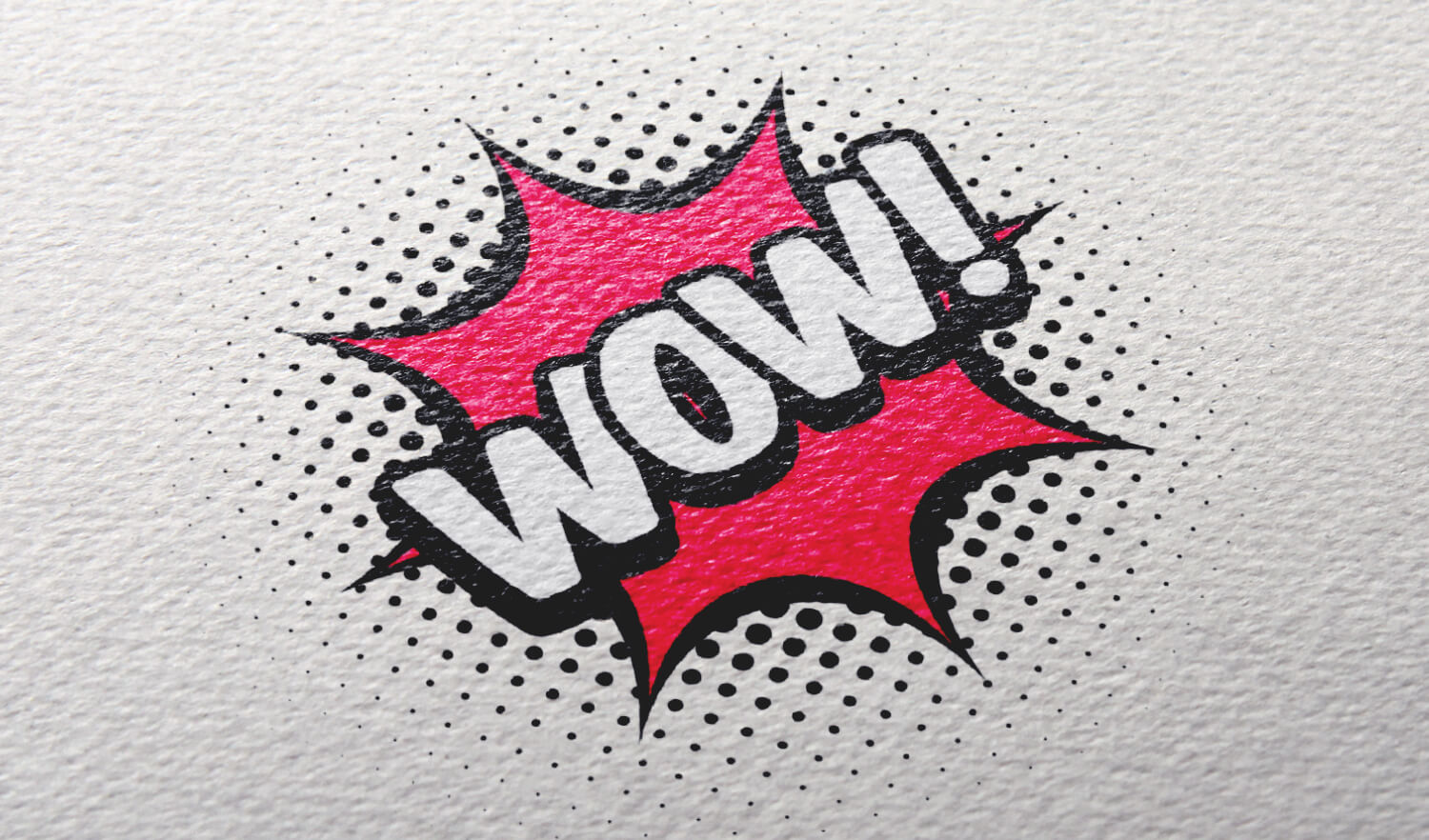
I am down for stylistic choice rather than wholly practical but it needs to still take into account that. You can use colors that contrast as well as black and white without being that, even work with colorblindness.
I don’t want them to lose color just hoping to make their art more approachable.
Sure, or drop shadow or outline. Few tricks of the trade, tone and value could work by intensity. Just make sure to take a step back from the computer and see if you can still tell what it is from a different angle (doesnt have to be perfect but tell what it is)

Maybe try using a color wheel to find some complimentary colors that contrast better by the way.
Or even talk balloons that are just a white background with black font
I am down for stylistic choice rather than wholly practical but it needs to still take into account that. You can use colors that contrast as well as black and white without being that, even work with colorblindness.
I don’t want them to lose color just hoping to make their art more approachable.
I can for sure make the colours for the bubbles & the text divide better by way of Value.
Sure, or drop shadow or outline. Few tricks of the trade, tone and value could work by intensity. Just make sure to take a step back from the computer and see if you can still tell what it is from a different angle (doesnt have to be perfect but tell what it is)